|
Color Profiles
Goals
In this chapter you will learn the basic of RBG, CMYK and Pantone colors.
Content in a nutshell
- RGB is a three-color profile that is for digital purposes
- CMYK color is a four-color profile that is for printing purposes
- Pantone colors are used for printing purposes and they form a more accurate end result. However, they are slower to mix and more expensive than CMYK colors
RGB
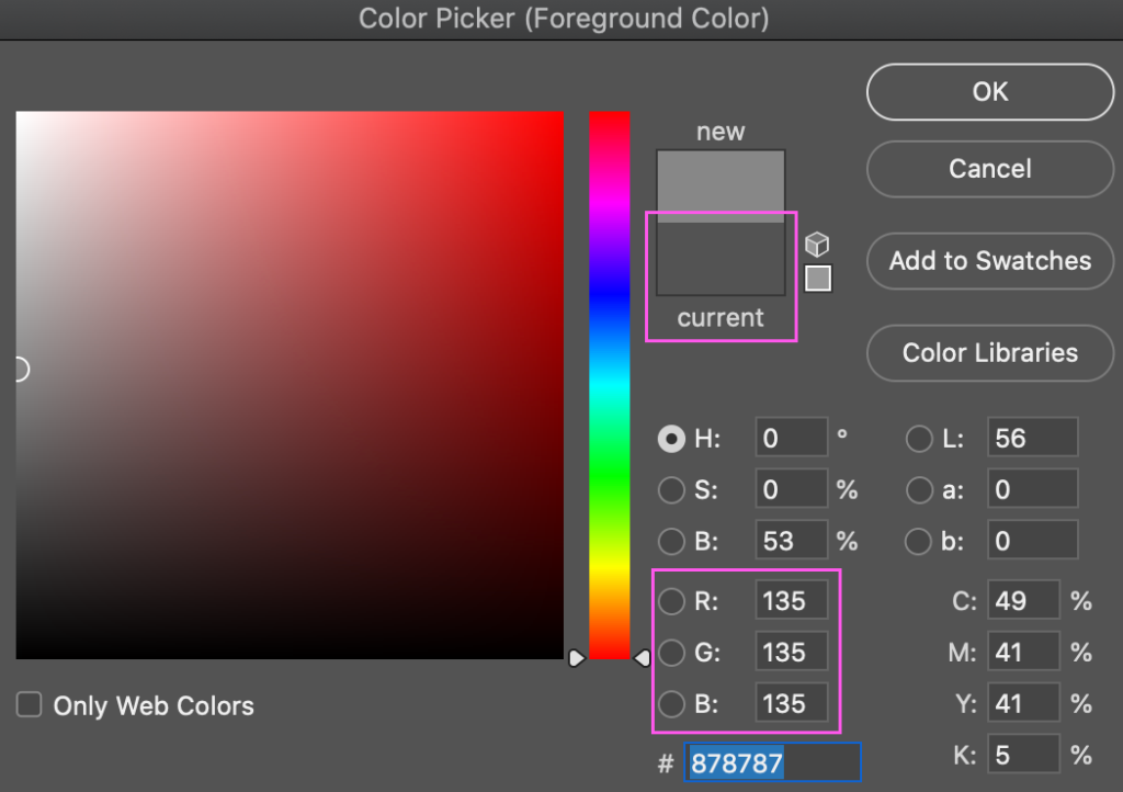
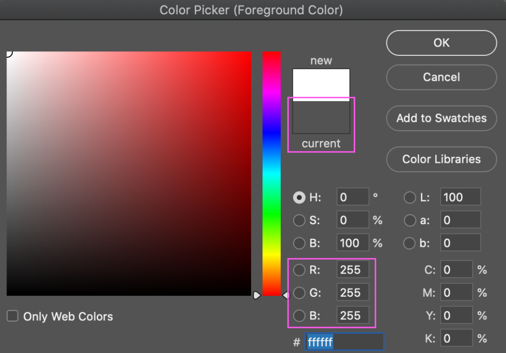
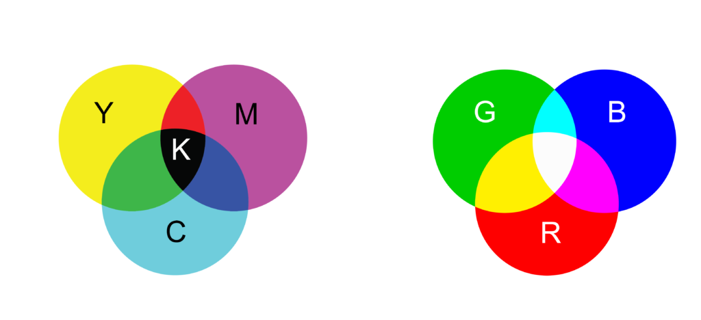
The very basic thing you need to understand about different color modes when working with images is the division between CMYK and RGB. You can go much more into details with different color profiles, but the most important thing to know is that RGB stands for digital images where CMYK stands for printed images. RGB refers to the primary colors of light, Red, Green and Blue, and is used in digital platforms. Together with light from the device these three primary colors form a pure white when combined together in equal amounts.
Together (red-green-blue) with light from the device these three primary colors form a pure white when combined together in equal amounts. Pictures: Liisa Hannula
CMYK
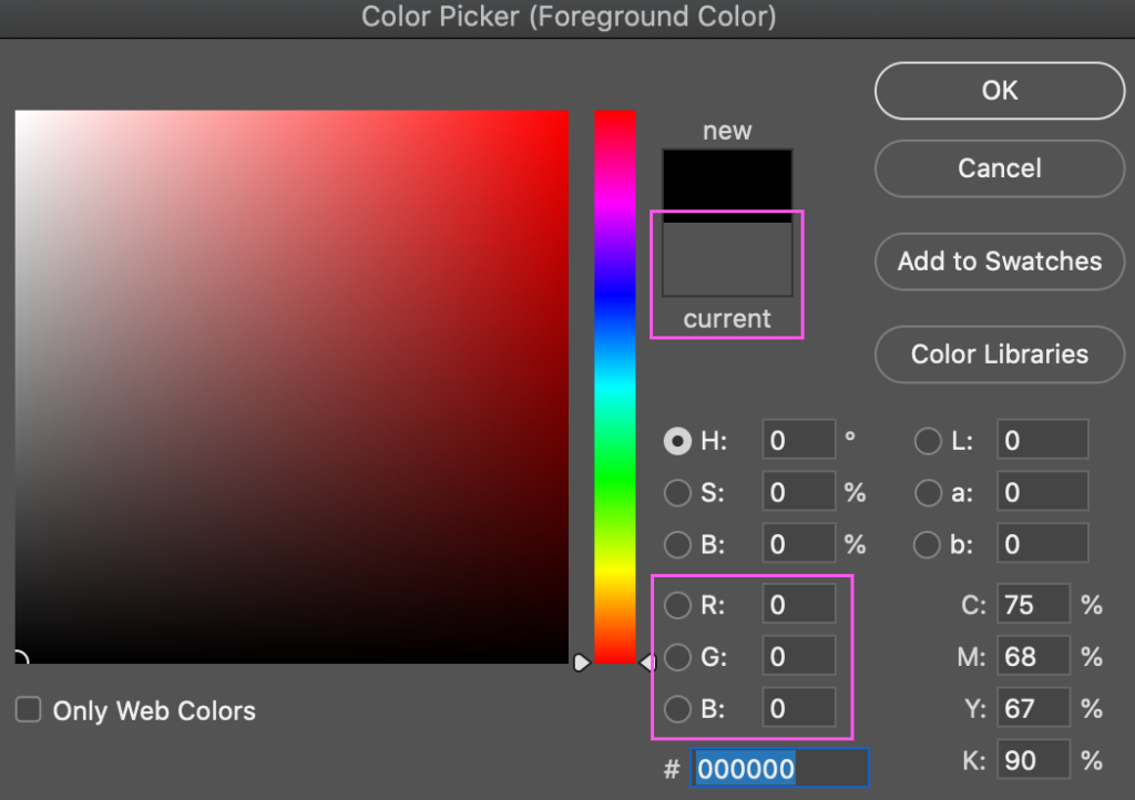
CMYK, on the other hand, is used for printed material and the colors are Cyan, Magenta, Yellow and Black (Key). Where RGB colors together form pure white, CMYK colors form pure black when combined together in equal amounts. That is because CMYK colors represent the printing process, where the ink is layered on white paper, forming different colors and brightness levels. When designing a product for printing purposes, working digitally with CMYK color will give you a more accurate result.
One might wonder why the color profile isn’t called CMYB. The "K" in CMYK refers to the "key plate" in the 4-color printing process. The key plate which is usually impressed using black ink provides the lines and/or contrast of the image with other colors. B also stands for Blue in RGB color mode, so that might be one of the reasons why K has kept its place. On the other hand, the definition RGB doesn’t need to include W for white, because white stands for light and the colors are made with only those three primary colors.
Picture: Liisa Hannula
Pantone
The Pantone color system (PMS) is also a good term to be familiar with since it is an integral part of printed products. Pantone colors are also called spot colors. Pantone colors are always mixed with different colored inks before printing, so you always get the right kind of color without a CMYK-like four-color process where the colors are layered on top of each other. The advantage of Pantone colors is therefore the uniformity of colors and the reduction of alignment problems.
Not all colors can be reproduced by printing with CMYK colors, so Pantone colors can thus expand the color reproduction of a printed product. Pantone colors can be extracted from printed PMS color charts using sequence numbers. The advantage of using Pantone colors is a safe result - the printed product is exactly the color selected from the color chart.


